bd2 / insights / A brand new bd2
A brand new bd2
After more than quarter of a century in business, we decided the time was right for a brand refresh. It’s hard to explain what a big decision this is for a designer because we’re very, very precious about our own work. Not to mention that the previous logo has served us very well becoming a recognisable image. We realise there’s risk in changing this, but the name remains the same, so we don’t think anyone will fail to recognise it’s still us, but sometimes you need the fresh impetus of a new look.

Anniversaries are always a time for reflecting and planning. As bd2 enters its 27th [unbelievable!] year, as a creative and digital agency, we’ve been going through an in-depth review of the business leading us to make some changes and to ‘tighten up’ a few things. As part of what we’re referring to internally as a ‘reboot’, we’ve decided to take some of what would be our own advice to a client to reflect this refocus with a refresh of our own brand identity.
With any mature business, this is always a bit of a dilemma as there’s a strong argument for continuity - ‘if it ain’t broke
don’t fix it’ - offset by a desire to signify change. So we’re not changing the name or anything as radical as that, in fact we’ve retained many elements of our existing brand to ensure recognition going forwards.
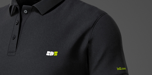
The focus has been on a new logo design which is also going to be used as a branded visual theme and can be seen in our interim website We’ve also devised a new strapline along with a series of enhancements and additions.

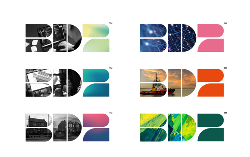
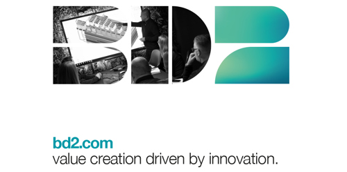
The logo is based on a building blocks concept to reflect both the content blocks we use to build web pages in Umbraco, and the basic principles of composable architecture in which different platforms are integrated using APIs to enable automation and data sharing.

In order to reinforce the brand image, the logo is used as a device to contain imagery combined with complimentary colours. The colour palette has been extended from black, white and zest to include three new colours and a series of abstract gradients. The use of imagery and colours within the blocks is unrestricted.
We’ve put a lot of thought into 'sharpening up’ our messaging. Our ‘why’ proposition has been tweaked to incorporate a new strapline ‘value creation driven by innovation’. Which neatly summarises our overall objective to add real value and bottom-line, tangible business benefit to the businesses we work with.


We’re proud of the many companies we’ve supported on their growth journeys over the years, some recent examples are featured in this latest edition. Others include the clothing distributor which had revenues in the mid £20M before we took them on a journey into e-commerce which saw online sales top £100M driving overall revenues over £160M. The supplier of screws and fastenings to the building trade whose online sales accounted for less than 8% of their turnover before we built a new platform which grew online sales to over 60% of turnover, underpinning year on year revenue growth of 20%. And earlier this year we launched a new e-commerce platform for a clothing distributor which has seen sales grow from just over £100K in week one, to £640K in week 12.
We believe our new strapline reinforces this value-add proposition, which is achieved through our innovative and
creative approach, and we believe our refreshed brand gives us a striking identity to carry us forwards.
We’re now working our way through the implementation of the new brand with new digital and physical assets. This interim website is one of the first items to benefit from the new look and we hope you like it as much as we do.
