
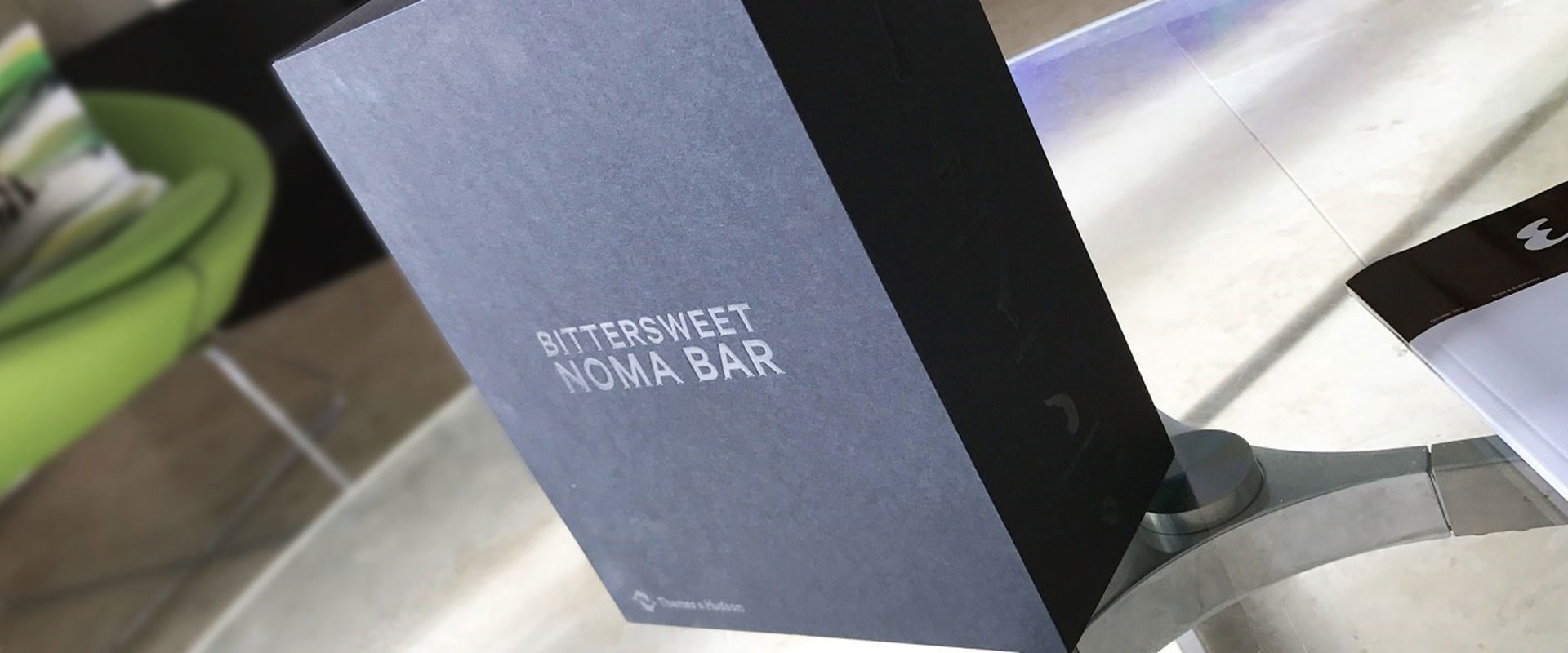
I recently indulged myself with the slightly extravagant purchase of ‘Bittersweet’, a collection of the works of renowned illustrator Noma Bar. It’s a limited edition, which would grace any coffee table, of one thousand books presented in five separate volumes housed in its own slip case published by Thames and Hudson. Each book is lavishly produced with embossed linen covers, case bound with uncoated and coated stocks all printed with supreme quality – the solid blacks are almost as dark as deep space – and includes an exclusive screen print all presented in a die-cut slip case. There are four books of illustrations grouped into themes: ‘Pretty Ugly’ includes celebrity portraits from Bin Laden to Jamie Oliver, ‘In Out’ is all about sex, ‘Life Death’ focuses on conflict and war, ‘Less More’ features daily life and there’s a fifth book showing Bar’s methods, sketches and the stories behind his inspiration.
Noma, born in Israel in 1973 but now working in North London, has worked for Time Out, the BBC, Random House, The Observer, The Economist, The Guardian, Wallpaper* magazine, Time Out, Wired and on many advertising campaigns. He has illustrated over one hundred magazine covers, published over 550 illustrations and released three books as well as the new Bittersweet collection. His work has won many awards including a Gold Clio, a Yellow Pencil award at the D&AD Professional Awards and his exhibition at the London Design Festival was nominated in the graphics category for the Beazley Designs of the Year, currently housed at the Design Museum.
Noma’s bold use of colour and simple forms belie a subtle double meaning to nearly all his pieces which generally lead to an ‘aha!’ moment – when you spot the joke or the double meaning, the image within an image. These are often created with a brilliant use of negative space and it’s this combination of apparent simple graphic forms into which a clever double meaning is interwoven that add a level of sophistication, surprise and humour. For example, Basil Fawlty’s features double as a finger ringing a buzzer suggesting his role as manager of Fawlty Towers and Shakespeare’s features are formed from a question mark. “It’s the wit and desire to engage with people – to make them think or make them smile – that makes Bar’s work so effective.”
As well as the visual puns and humour of his illustrations, Noma has used his style to comment on more serious subjects, principally war. He was born in Israel during the Arab-Israeli war and served in the Navy before studying at art school which he says he turned to as a way of reclaiming his identity following military service. These illustrations are shown in the ‘Life Death’ volume which includes images from his thought-provoking 2013 exhibition ‘Cut the Conflict’. He combines symbols of war, such as a gun or a soldier, with those associated with peace to make viewers think about conflict and how we see people from opposing nations.
“Noma Bar loves to tell visual stories. With a deft touch he can imbue simple graphic forms with political and social commentary, or manipulate everyday icons to create witty, double-take images that make you look once, twice, three times. With his bold use of colours, shapes and pared down iconography, Noma’s instantly recognizable style has established him as one of the world’s most in-demand illustrators and an Outline Editions favourite.”
This beautifully presented collection is an amazing reference for all graphic designers, illustrators and any follower of visual and popular culture. Bar’s illustrations tells stories that are hidden in the details, with the message revealing itself as you look more closely to amuse, delight or provoke.